Dense and Veiled: Reading Two Recent Swamp Landscapes through Theodore Adorno and Edward Hinton.
Introduction
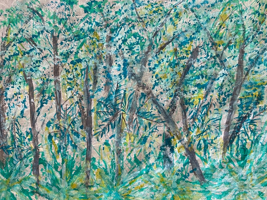
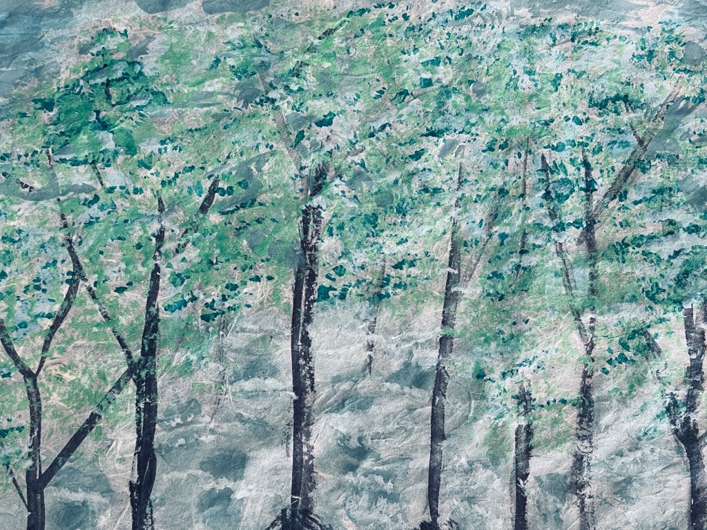
The two recent paintings under consideration present two wetland scenes rendered in a loosely impressionistic manner. The first, with its dense undergrowth and diagonally thrust trunks, overwhelms the eye with layered strokes of green, turquoise, and ochre. The second, lighter and more spacious, portrays upright trunks receding into a mist of grey-green foliage. This essay draws on Theodor W. Adorno’s Aesthetic Theory and Edward Hinton’s Color and Perception: Essays on Chromatic Abstraction to argue that these works enact a conversation on resistance and reconciliation—between sensory “thickness” and atmospheric “veiling”—that exemplifies both Adorno’s concept of non-identity and Hinton’s analysis of chromatic depth.
Adorno: Non-Identity and the Swamp as Resistance
Adorno insists that authentic art resists mere imitation of nature; instead it presents nature’s contradictions and estrangements. “Art,” he writes, “is the semblance (Schein) of what is not” (Adorno 1997, 5). In the first painting, the eye does not encounter a smoothly ordered vista but a thicket of overlapping gestures. The trunks tilt at unstable angles, while the foliage dissolves into restless marks of teal, yellow, and viridian. This composition frustrates the viewer’s desire for a single horizon line or coherent path, echoing Adorno’s claim that modern artworks “refuse” the reconciliation promised by traditional perspective (ibid., 111–113). The painting’s very density stages what Adorno calls “non-identity”—a refusal to let nature be reduced to a conceptual grid, presenting instead an unruly multiplicity.
By contrast, the second painting allows for greater visual breathing space. The trunks rise vertically and the canopy is rendered in a stippled but more even manner. This does not produce classical realism, but it does offer what Adorno would call a “semblance” of reconciliation: a hint of order and calm that never fully resolves (ibid., 168). Where the first work immerses the viewer in a resistant tangle, the second invites contemplative distance.
Hinton: Chromatic Interference and Veiling
Where Adorno provides a philosophical account of the paintings’ structural tensions, Hinton’s writings on color offer a more perceptual analysis. In Color and Perception Hinton argues that chromatic depth can be created without linear perspective through two main strategies: “chromatic interference” and “chromatic veiling” (Hinton 2002, 64, 88). The first involves placing small shifts of hue in close proximity so that the viewer’s eye oscillates between them, generating a tactile sense of space. The Impresionists were masters of this technique. The second relies on translucent layers of related hues to create a unified but atmospheric field, similar to tonality.
The first painting exemplifies “chromatic interference.” Its turquoise and citron strokes, interspersed with darker greens and browns, produce subtle after-images and vibrations, making the wetlands appear thick and almost tactile. This vibratory energy aligns with Adorno’s “non-identity”: the eye cannot settle into a single reading of figure and ground.
The second painting exemplifies “chromatic veiling.” Here the grey-green washes soften the boundaries between foreground and background, creating a spectral, misty depth reminiscent of Impressionist envelope effects. This veiling trades the immediacy of interference for a calmer, more unified atmosphere—echoing the movement from resistance to semblance that Adorno identifies.
Dialectics of Resistance and Reconciliation
Taken together, the two works enact a dialectical movement that is central to Adorno’s aesthetics. Art’s task, he argues, is neither to copy reality nor to offer pure abstraction, but to hold opposites—nature and history, subject and object—in tension. The first painting holds fast to resistance: thick brushwork and color interference deny any simple pictorial resolution. The second painting gestures toward reconciliation: veiling and spacing create a sense of openness without collapsing into decorative prettiness. This tension mirrors what Adorno calls “the truth content” of art—its ability to point beyond itself precisely by not fulfilling the viewer’s wish for harmony (Adorno 1997, 132).
Hinton’s framework amplifies this point at the level of perception. The shift from interference to veiling is not simply a technical change; it corresponds to a phenomenological shift from tactile immediacy to atmospheric contemplation. In other words, the two wetland scenes don’t just depict different kinds of wetlands —they enact different modes of seeing.
Conclusion
Read through Adorno and Hinton, these two landscapes appear not as simple exercises in naturalistic depiction but as experiments in how painting can stage a dialectic of vision itself. The first uses density and chromatic interference to immerse the viewer in a resistant, non-identical nature. The second uses openness and chromatic veiling to gesture toward reconciliation without surrendering to it. In doing so, the works exemplify Adorno’s claim that “art is the refuge for the non-identical” (Adorno 1997, 5) and Hinton’s insight that color alone can structure the perceptual field. They are thus not only landscapes of wetlands but landscapes of perception.
References
Adorno, Theodor W. Aesthetic Theory. Translated by Robert Hullot-Kentor. Minneapolis: University of Minnesota Press, 1997 [1970].
Hinton, Edward. Color and Perception: Essays on Chromatic Abstraction. London: Routledge, 2002.
